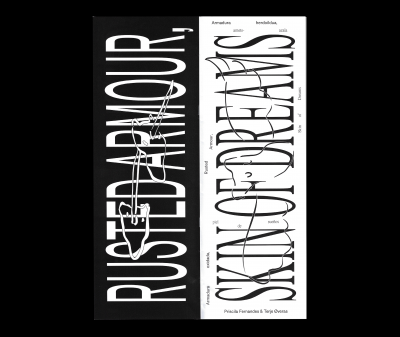
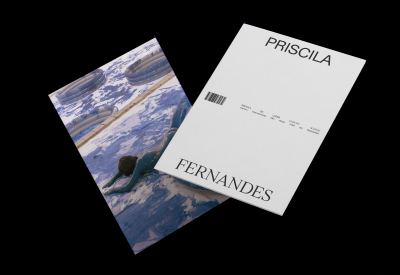
Bringing the dream home: Priscila Fernandes, David Hanvald and Jessica Stockholder
David Komary
Text of the exhibition at Gallery Stadpark, Krems, Austria.
20.06.2015 - 8.08.2015
Published in 2015
By Gallery Stadpark, Krems
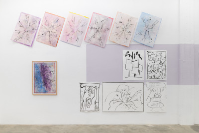
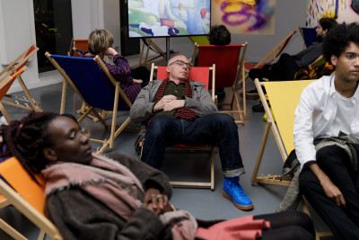
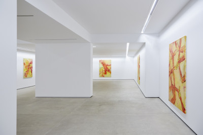
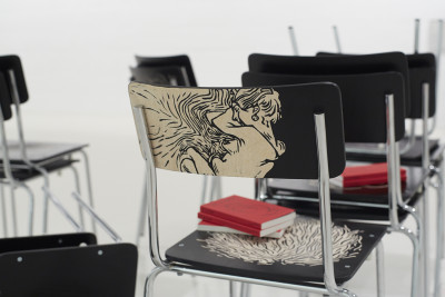
Bringing the dream home examines relationships between three artistic positions that share a playful approach to color. The works of Priscila Fernandes, David Hanvald, and Jessica Stockholder inherently work with aspects of painting that cannot be simply understood as painting in a material sense, as an aesthetic-technical process. Instead, the core relation to color that the works share often unfolds in the context of painting and architecture, even if the artists’ individual modes of working—in painting, sculpture, video, and conceptual processes—represent very different uses of media. The exhibition explores the relation between art and the everyday (Stockholder, Fernandes) and also between art and architecture (Fernandes, Hanvald). The works of Fernandes, Hanvald, and Stockholder share an aesthetic of fragmentation and, to a certain extent, improvisation. Whereas Stockholder and Hanvald clearly have a painterly conception of color—in which Hanvald takes the more pictorial approach and Stockholder pursues an expanded notion of painting—Fernandes draws on the repertoires of form and color from modern architecture. In terms of its exploration of color Bringing the dream home is therefore not only defined by a perceptual-aesthetic concerns but also by a referential and historically reflective perspective. In the context of the exhibition, color functions as a hinge for aspects of form and content. On the one hand, it is a common link that joins the practices presented. On the other, color develops its own “semantics” in the content of individual works.
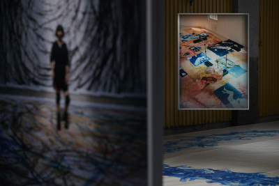
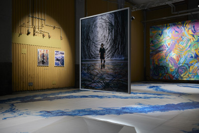
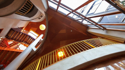
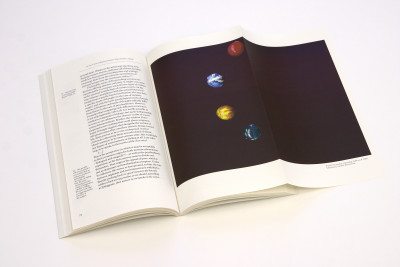
That which is above that which is by Priscila Fernandes shows interior views of the Sonneveld Huis in Rotterdam. The building, an icon of Dutch modern architecture (1933), is permeated by use of color that establishes a connection between all aspects of the building’s design and furnishings, such as walls, tiles, and furniture. Observers find themselves inside a system of color and form associated with specific socio-political ideas and hopes of the modern era, which are conveyed to the viewer (at least in a fragmentary and semi-conscious manner). Here color functions as a visual anchor for the language of color and form characteristic of the modern era. In this walk through the building, which at times feels very spontaneous and at others poetic, Fernandes not only focuses on certain culturally embedded canonizations and interpretations of the modern, but she also raises the question as to her own standpoint in relation to the “inscribed” history of the building. The obviously disparate quality of the footage and camera sequences foregrounds the impression of a subjective view, as if the artist were attempting to remove cultural layers and sediments to enable an immediate perceptual experience. Fernandes is less interested in the authority of the historical building and the familiar way in which it is perceived than in the question of the unconscious affirmation of the formal language constituting architectural “common sense” and informing urban taste.
The work That’s what it’s all about also presents the viewer with a filmed inspection of the building in an attempt to subjectivize an architectural work of the modern period. The artist undertakes a kinesthetic interrogation of the Algemene Rekenkamer by Aldo and Hannie van Eyck. The perceptional focus of the film is on details, on relationships of form and the structuring use of color spanning several stories and even extending beyond the interior. Fernandes studies various views through the building, follows the alternation of colors and patterns, and traces spatial structures with the focused gaze of the camera. The impression grows that the artist is attempting to experience the building in a tactile, haptic, and kinesthetic manner, instead of simply filming or depicting it. Beyond this scrutiny of structural or architectural characteristics, the iconic presence of what is observed, qualities of abstraction and color, come to the fore. Instead of being able to rely on familiar modes of representation, such as the book presented at the beginning of the film, observers must depend on their own perceptions, on constructive vision.
Fernandes employees the camera as an extension of her body to counter a monocular and distanced mode of representation and visualization—by engaging in a kinesthetic form of perception involving the entire body. The locomotion of the body in space and the searching movements of the eye are translated into the pans and motion of the camera. What initially seems to be a depictive presentation of the building is thus disrupted, distorted, and called into question. The artist seems to be using this kind of synthesis of the film image and body to reenact one of utopian ideals of modern design, the aspired link between art/architecture and everyday life. In a similar manner, in That which is above that which is the interior becomes a guide to action, a dispositive of everyday action in space. For example, through analogies of color—the peeling of a lemon, the cutting of a cucumber, or the opening and closing of a kitchen drawer—connections are made with the architecture. Fernandes’ pictorial language, which initially appears documentary, slowly transitions into a poetic visual continuum consisting of close-ups and fragmentary action. Form and action, interior and exterior are shown in a relationship that increasingly assumes the aspect of mirroring. Fernandes does not merely present a performative affirmation of architectural ideas; she emphatically lends the scenario the aspect of a still life; the Dutch still life asserts its relevance as a genre, in which subtle and sophisticated codes of form and color represent an “order of things.”
The David Hanvald and Jessica Stockholder both explore a notion of expanded, installation-based painting. The frame of the canvas is by no means the only sovereign “site” of pictorial activity. Through the use of color the artists manage to unify disparate objects into three-dimensionalized painting medium. Color functions independently, as means of evoking visual space; it unfolds its effect without being limited to a two-dimensional surface. The works of Hanvald and Stockholder convey a playful dimension, and they manage to overcome and suspend the limits of the image in an almost incidental and natural manner.
From the beginning David Hanvald has been concerned with finding means to circumvent or subvert the act of painting, the choice of artistic devices, and aesthetic decision-making. Hanvald does not merely intend to question the will as a formative power but to strategically negate this instance. He specifically counters the notion of the “skillful” picture as confidently developed by the artist in relation to space through the use of playful, aleatoric, or even random elements as definitive of an aesthetic of production. A lack of orientation in his process forms the crux of his aesthetic strategy. The material is to be made to “function” within the aesthetic process, without being instrumentalized by the impetus of genius. For Hanvald, the greatest possible moment of freedom is founded on the material and not on the status of the artist in the context of the painting process.
Hanvald is interested in the non-image, for example the painting’s periphery. In a number of his paintings dating from recent years, the edge of the painting becomes the actual object of investigation. Blocks of color are grouped around an empty center and seem to indicate the underlying frame of the canvas, sometimes apparently forming its shadow. This is by no means an act of depiction; these areas of the painting are defined by colorful-abstract and almost gestural markings.
In Construction Toy / Der Baukasten Hanvald presents an arrangement of images, a composition that unfolds in space and veritably “goes around the corner.” The impression that it conveys—of an extended wall of building blocks—is not coincidental. Hanvald has shaped the canvases like bricks. The constellation of paintings, the composition of the work, can thus be assembled differently each time. The application of paint to the individual components suggests markings. Through the most minimal artistic intervention possible, they transform the two-dimensional building elements into potentially aesthetic units of construction. To a certain extent Hanvald’s ironic and iconoclastic series of images leaves the viewer perplexed. Where one expects to find an image, one discovers an apparently random arrangement. Nevertheless, despite all his efforts to subvert the intentional act of pictorial creation, he manages to present the viewer with a space of aesthetic possibility, in which one’s own gaze is engaged as a formative agens—a process that is thus made obvious and observable.
In the paintings, sculptures, and installations of Jessica Stockholder, image and space maintain an osmotic relationship to one another; real space and pictorial space transition into one another and merge. At first glance, Stockholder’s sculpture Untitled from the year 2000 appears to be an interior-like arrangement with sculptural presence. The objects that it contains are everyday objects—a bag, a rug, a lamp, and also a picture. In sculptural terms the work demonstrates a clearly narrative element. It forms a scenic constellation that even seems to indicate a palpably absent protagonist. In addition to this narrative aspect, the arrangement evokes a decidedly pictorial effect, which diminishes and overwrites the solitary “objectness” and function of individual elements.
The lamp, rug, and picture meld into a three-dimensional image. The individual objects “embody” parts of a sculptural image in the manner of a color field. What at first seems to have a disparate appearance proves to be a precise, relational composition. The artist takes utmost care in the design and positioning of the objects. The elements are always selected and composed in terms of their color properties, always in consideration of their potential to materialize and embody color. In this manner Stockholder lends the constellation of objects an independence that is diametrically opposed to the provenance of the objects. The repainting and distortion of individual elements creates a binding element, a principle of pictorial inclusion using objects that are disparate in form and context.
Despite the fragmentation and open-endedness of its formal language, Untitled assigns the viewer a clear and explicitly pictorial standpoint. In this work the practice of sculpture functions to create a concentrated image. The viewer encounters a composition that is defined by coexistence and simultaneity and determined by object-like and pictorial events. Stockholder thereby generates an expanded form of installation-based painting, which assumes the link between image and space as a given. She also achieves a connection between the perception of art and the everyday. Much like Hanvald, she uses an aleatoric approach to refer viewers to their own perceptual agency and role in the evocation of the image.
In the exhibition Bringing the dream home color cannot be reduced to a material, physical element in the sense of a surface phenomenon or the property of an object. Instead, on the one hand, color reveals itself as an ephemeral occurrence. Thus the color of Stockholder’s interior lamp seems veritably self-illuminating, and the neon-like tones used by Hanvald almost seem to form a film-like layer, through which one potentially sees an altered reality. On the other hand, in the work of Fernandes color appears in slowed, fleeting forms on the screen. In this interpretation, color phenomena become perceptive events in the eye of the observer. Still, apart from the aesthetic dimension guiding the reception of the works, color functions as an agens; it assumes an agency in all three approaches, unfolding a phenomenological presence. Color thus gives rise to an actualization of perception, a visual realization on the part of the observer. This dual status in the function of color overlies each perceptual situation; there is the “physis” of the concrete presence of color and color’s simultaneous fleetingness and immateriality. As a result, the narrative and referential content of what one sees is diminished; the referential object is ultimately transcended; and the actual perception itself becomes the real site of aesthetic interrogation.
David Komary
READ MORE...
EDP Novos Artistas - Priscila Fernandes
Delfim Sardo
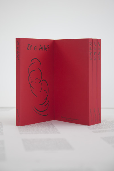
Portuguese version of the text for the catalogue of EDP Novos Artistas, Portugal, 2011.
Published in 2011
By Fundação EDP
Pode não parecer à primeira vista, mas as duas obras em vídeo de Priscila Fernandes em exposição no Prémio EDP são sobre pintura. São-no cromaticamente, tematicamente e didacticamente. São-no também metodologicamente.
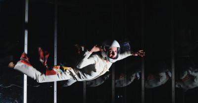
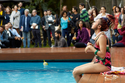
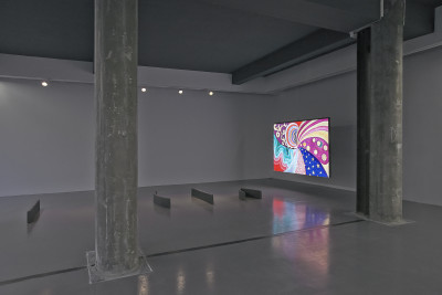
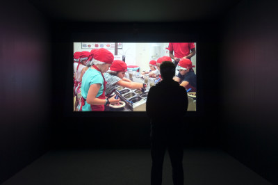
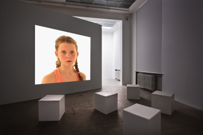
As duas obras, embora em suporte videográfico projectado, são de naturezas diferentes - uma é um vídeo projectado numa sala, com a projecção alterada para um formato praticamente quadrado, no qual se podem ver duas personagens: uma jovem púbere que canta um excerto da ária da Rainha da Noite da ópera de Mozart A Flauta Mágica, que ri e que nos olha perversamente, despeja por terra um jogo de construções que será metamorfoseado num outro, com peças que são sólidos de madeira pintados de azul, branco, amarelo e vermelho que uma outra criança irá separar cromaticamente.
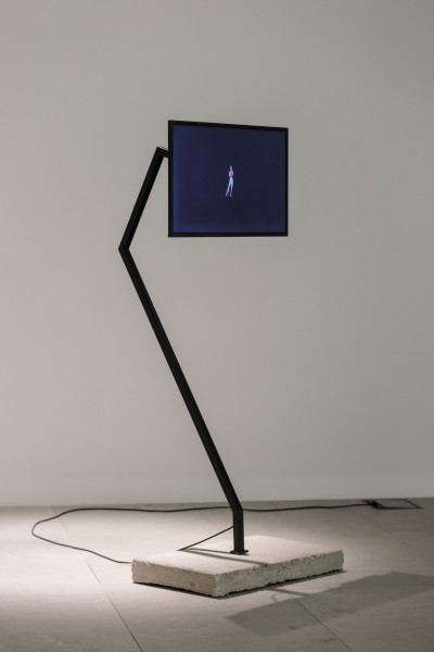
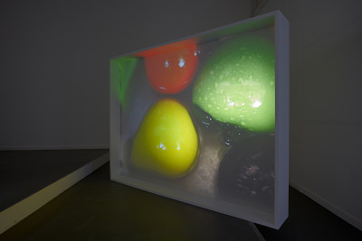
O segundo vídeo é uma pintura em vídeo, emoldurada em branco, autoportante como uma escultura no centro do espaço expositivo. Nesta outra peça há um conjunto de imagens de limões, maçãs, pimentos e pepinos que são descascadas para uma tina azul de plástico, imagens de planos de cor no universo da cozinha e sons parasitários sintéticos e discretos, barulhos de elevador, resíduos sonoros urbanos.
Em ambas as peças há uma comum evocação da pintura, mas de específicas tradições dentro da pintura e da sua história: no primeiro filme há uma evocação da pintura flamenga, bem como dos retratos de Gerhard Richter desembocando em Mondrian (esta sim, uma referência comum aos dois trabalhos) e na memoria do suprematismo russo, ou do ponto de confluência entre este e o movimento De Stijl.
A zona mais interessante desta peça prende-se com a perversidade do riso da jovem pré-adolescente, não só evocador da personagem feérica concebida pelo libretista Emanuel Schikaneder, mas que comporta uma estranha carga erótica e de desajustamento, como se o puzzle derramado no chão só pudesse ser resolvido candidamente. De uma forma curiosa há uma alusão (talvez não intencional por parte da artista) à forma lúdica como o movimento neo-concreto brasileiro lidou com a pesada herança modernista das primeiras bienais de S. Paulo, resolvendo a ligação entre formalismo e espacialidade háptica a partir da mesma matriz lúdica.
No segundo filme, a questão espacial da pintura é tomada de uma forma quase didáctica: a moldura que envolve a retro-projecção confirma o vídeo como uma pintura que resolve ludicamente e performativamente a questão da transição entre o universo maneirista da natureza-morta – tão explicitamente apresentada nas frutas que bóiam na tina – e a crecente abstractização da cozinha moderna, como se a pintura fosse um campo culinário de condimentação formal, crescentemente atravessado pela morte dos seus componentes. A alegoria do filme, se remete para a pintura e a sua história moderna, convoca uma outra problemática, a da espacialidade interna e externa do objecto quadro, transformado pelos processos da projecção num elemento escultórico, seguindo um outro processo histórico marcante, o da conversão das questões artísticas em problemas de espacialidade que se jogaram no centro da década de sessenta a partir do minimal. Da pintura para a escultura, o processo contado por Priscila Fernandes define-se, nesta peça, pela narratividade do que nela se passa – cortar, descascar, dispor, como uma metáfora dos processos da escultura, escavar, modelar, construir – mas também pela qualidade objectual do mecanismo de projecção, que interfere com a deslocação do espectador ou a integra como sombra. Neste último caso, mais performativo dos corpos que passam pelo espaço, sobressai o carácter teatral da peça, retomando a história teatral da pintura holandesa, a questão da deposição de uma ordem politica a partir do movimento do corpo, como na Ronda da Noite, de Rembrandt.
Entre pintura e pensamento sobre o espaço, entre formalismo, composição e o carácter lúdico do jogo, as obras de Priscila Fernandes localizam, a partir da matriz da sua formação nos países baixos, um conjunto de questões importantes no universo do pensamento problematizador sobre o moderno, estabelecendo isomorfismos entre a pintura, a espacialidade e a corporalidade do objecto no espaço que se sustentam na leveza didáctica da insinuação.
READ MORE...
EDP New Artists - Priscila Fernandes
Delfim Sardo
English version of the catalogue text of Prémio EDP Novos Artistas, 2011.
Published in 2011
By EDP Foundation
In may not seem so at first sight, but the two video pieces brought by Priscila Fernandes to the EDP Prize exhibition are chromatically, thematically, didactically and methodologically about painting.
The two works [Product of Play and That Which is Above That Which is], in spite of bring presented as video projections, have distinct natures – one is a video projected in a room, its projection format changed to a nearly square shape, featuring two characters: a pubescent girl who signs a fragment of the Queen of the Night aria, from Mozart’s opera The Magic Flute, while at the same time laughing and looking at us wickedly. She also scatters across the floor a construction toy set, which then turns into a different one, consisting of wooden pieces painted in blue, white, yellow and red, which another child will divide according to their colour.
The second video piece [That Which is Above That Which is] is a video painting, in a white frame, self-contained as a sculpture in the centre of the exhibition space. This piece displays a number of pictures of lemons, apples, bell peppers and cucumber, which are peeled into a blue plastic bowl, images of colour areas from the kitchen universe and synthetic, discreet parasite sounds, elevator noises, urban sound debris.
Both pieces share an invocation of paintings, but from specific traditions within painting and its history: the first film contains references to Flemish painting, as well as to Gerhard Richter’s portraits, and also to Mondrian (evoked in both works) and the memory of Russian suprematism, or of its confluence with De Stijl movement.
The most interesting part of this pieces has to do with the perversity of the young pre-teen’s laughter [Product of Play], which not only evokes the fairylike character created by librettist Emanuel Schikaneder, but contains a strange charge of eroticism and maladjustment, as if the jigsaw puzzle scattered on the floor could be solved candidly. Curiously there is also an allusion (perhaps not intended by the artist) to the playful response of the Brazilian neo-concrete movement to the modernist legacy that weighed upon the early São Paulo Biennales, which allowed them to unite formalism and haptic spatiality.
In the second film [That Which is Above That Which is], spatiality in painting is approached in a near-didactic way: the frame that encloses the rear-projection confirms the video as a paintings that playfully and performatively carries out the transition between the mannerist universe of the still-life – so clearly visible in the vegetables floating in the bowl – and the increasingly abstract look of modern kitchens, as if painting were a culinary field of formal seasonings, increasingly suffused with the deaths of its components.
Besides evoking painting and its modern history, the film’s allegory also deals with the issue of the inner and outer spatiality of the paintings as an object, which has been transformed by the process of projection into a sculptural element, in accordance with another important historical process: the transformation of artistic issues unto issues of spatiality, explored by minimalism around the mid-1960s. From paintings to sculpture, the process narrated by Priscila Fernandes is defined, in this piece, but the narrativity of what happens in it – cutting, peeling and arranging appear as a metaphor of the sculptural processes of carving, modelling and constructing – but also by the objectual quality of the projection mechanism, which interferes with the visitors’ movements or includes them as shadows. In this last and more performative instance, of the bodies passing through the space, the theatrical quality of the pieces is heightened, evoking the theatrical history of Dutch painting, the issue of the deposition of a political order via the body’s movement, as in Rembrandt’s Night Watch.
Between painting and reflection on space, between formalism, composition and game playing, Priscila Fernandes’s pieces address, from the vantage point of her studies in the Netherlands, a number of important issues in the universe of reflection on modernity, creating isomorphic connections between painting, spatiality and the corporeality of the object in space, based on the didactic lightness of suggestion.
READ MORE...